5 things we love and 3 we love not about the iPhone 14 Pro’s Dynamic Island | 91mobiles.com

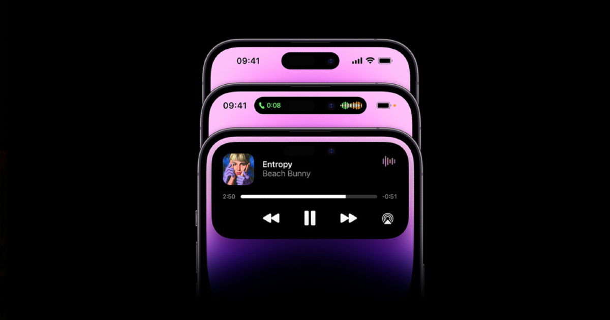
It is perhaps the most talked-about feature on the new iPhone 14 Pro, and in best Apple tradition, has ended up dividing the world into those who love it and feel it will change how we use phones, and those who think it is nothing more than “typical Apple razzmatazz to get attention.” We are talking of Dynamic Island, Apple’s reimagination of the notch on the iPhone, changing it from a static rectangle on the top of the phone, to an interactive cut-out capsule and a punch hole just below the top.

Thanks to some OLED display magic which makes pixels go dead black, these two cutouts blend together to look like a single entity and also change size and display animations and information. These are very early days for the feature but based on our sojourn on the Dynamic Island, we are wagering that notches might get flexible on all phones in the coming days. Of course, it is not all roses for Dynamic Island. There are a few thorns too. So after our first few days there, this is what we love, and not love not, about the iPhone’s Dynamic Island:

Ain’t this amazing: Why we love the Dynamic Island
It is a new way to interact with the phone…and looks cool

The part of us that simply loves new UI touches adores Dynamic Island. It provides us with a whole new way of interacting with the phone. It is also very lively and has a definite ‘cool’ visual quotient to it, which at the time of writing, no other phone possesses (Android devs are at work on it already, we hear). With its sleek design and smooth functioning, Apple has made a feature that was considered an eyesore a thing of beauty, or at least, of great visual interest. And of course, to those who want to make sure that the world knows they have a new iPhone, this is the most distinct feature to flaunt.
It makes the notch more functional

Contrary to what some believe, the original notch was not a design statement by Apple. It was actually added to facilitate Face ID, allowing users to securely and speedily unlock an iPhone by just looking at it. It enabled Apple to do away with the trademark round home button and fingerprint scanner below the display of iPhones until then, and instead provide users with an almost all-display front with thin bezels. The notch contained a selfie camera and sensors to enable a secure and quick face unlock experience. So it was actually a functional feature rather than a design touch. There was, however, nothing that you could actually do with the notch. The Dynamic Island changes that with the area around the new capsule-shaped punch hole expanding and contracting and becoming a sort of notification that you can see without having to swipe down. Technically speaking, the notch is still there, but now it does much more.
It is handy for the “doing something else without leaving what you are doing” sort of multitasking

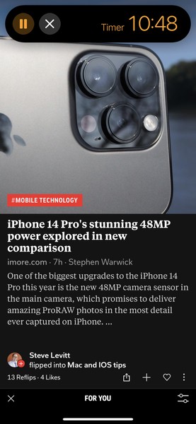
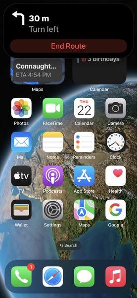
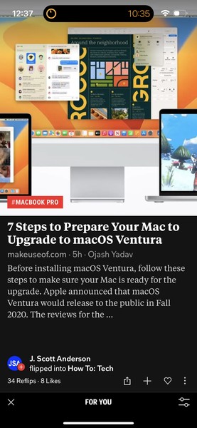
The Dynamic Island is a very handy tool for those who want to do a few tasks without switching from their main task. It is not for the hardcore split screen, app-switching kind of multi-tasking crowd, but is perfect for those who want to do a task or two on the side even while sticking to their main assignment. So for instance, you can just change volume levels or switch audio tracks, or take or reject a call on the Dynamic Island without leaving your WhatsApp chat window or your endless scrolling sessions on Instagram. We did not have to bother with opening another app for the purpose – the Dynamic Island is like a handy sticky note that lets you continue your main task, while also attending to something relatively minor. If you DO want to open the relevant app, just tap on the Island and the app will open up, just like a widget. That said, functionality is a little limited right now – at the time of writing, you could not read or reply to short emails or messages from the Dynamic Island, but we expect more to start happening as the population of the Dynamic Island gets more appy.
It works incredibly smoothly
In spite of being a first-time effort that tries to pack information and animations into a very tiny space, the Dynamic Island works very smoothly indeed. It expands and contracts depending on the situation without any jerks or lags, and we have not seen it freeze or lag at all so far. Apple claims that this is because of a lot of hardware and software wizardry involving the high-quality OLED display and its own processor (“hardware and software anti-aliasing powered by Apple Silicon”). It works without a hitch, animations look fluid, colours look bright and even text and images are sharp, giving it the sleek feel of a well-rounded product rather than a still-developing first attempt (which it is). It would be great if it could actually become some sort of alternative to the notification area – one which one does not have to pull down to see and one which is always subtly there.
This is just the beginning, there’s more coming

The Dynamic Island might seem a little gimmicky right now, but that could change in the coming months, with a number of developers working on features and functions around it. There are a few developers who have already tweaked apps around it – a Reddit Client called Apollo actually makes a cat or a dog from what it calls the Dynamic Island Zoo appear on the Island while you are using the app, and there’s a game called Hit The Island which makes the Island a part of a Pong session with you having to use your paddle to make sure the ball hits the Island. There is more serious stuff on the way too – in the coming days, the Dynamic Island could get you updates on a cab you have ordered, live scores from a match you are following and much more, This could be an eco-system in its own right.
Ain’t this…odd: Why we don’t love the Dynamic Island
It is a little difficult to reach

The location of the Dynamic Island is kind of odd. It is on top of the display, which is not the easiest place to reach, especially if you are using it on the rather large iPhone 14 Pro Max. Even when you turn on Reachability to make the display more accessible by making the content slide down, the Dynamic Island and its controls remain right at top of the phone. We adjust the grip of the iPhone 14 Pro Max every time we have to use it. We will get used to it eventually, as we did to large displays, but it is rather inconvenient right now.
It is a little intrusive and distracting (and cannot be turned off or adjusted)
The Dynamic Island is surrounded by display on all sides. It is literally cut out of the display, while the notch was actually surrounded by the display on three sides, with its top flowing into the top of the phone itself. Perhaps it is just a matter of habit, but we found the notch a lot less intrusive than the Dynamic Island, which seems to intrude much more into full-screen images and videos, simply because it is surrounded by content on all sides. Also, while seeing animations and information in a cut-out on top of the display might appear cute for a while, it actually gets distracting. At the time of writing, there was no way of turning off or adjusting the settings (maybe fewer animations, maybe freezing it for a while) of the Dynamic Island. You have to live with it the way it is right now.
It could muck up the selfie camera

We have been using iPhones with notches since 2017 but we have had more smudges on the selfie camera of the iPhone 14 Pro Max in a week than we had on the others over five years. That was because there was never really any need for us to touch the selfie camera. That changes with the Dynamic Island, where every animation or notification tempts one to touch the area around the selfie camera.
All said and done, the Dynamic Island on the iPhone 14 Pro Series is definitely very prime, very appy real estate. If developed properly, it could well graduate to becoming a power in its own right. It is very much work-in-progress right now, but is proceeding along very promising lines.
For all the latest Technology News Click Here
For the latest news and updates, follow us on Google News.
