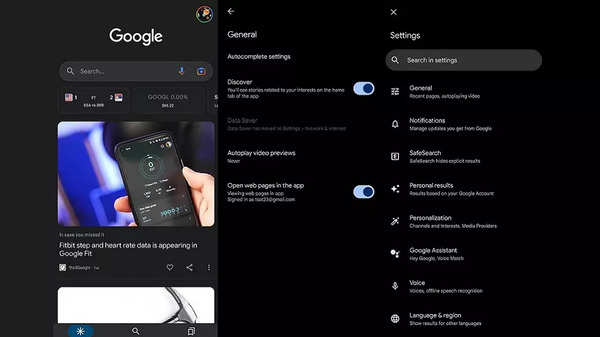
Back in 2021, Google introduced its Material You design, an enhancement of the former Material look, to Pixel devices. With its new approach in aesthetics, it revealed the plan to make the appearance of Google products streamlined across a variety of devices.
‘Material You’ in the Google app rolls out to limited users
As announced at the time of launch, Google’s strategy with the Material You design is a gradual rollout to the entire Google ecosystem. The latest app getting a makeover seems to be the Google app as its Material You version is up for users having the app’s beta access. To be more precise, the design update comes out with app version 14.4.
Google app’s new look brings these changes
The first thing users may notice is that the Material You update has replaced the dynamic colour accent with a simple blue accent in the bottom menu. Additionally, the icons at the bottom have adopted a pill-shaped indicator – putting them in line with the shape of the search filters in the Search tab. There are new Material You-themed toggles present all throughout the app.

Moving on, the Settings screen, in dark mode, shows up with a deeper black shade now. It has also received a neat change that makes reading the listed options easier – thanks to a clearer separation among them.
Moreover, the inner section includes account switcher, ‘Search history,’ ‘Delete last 15 minutes,’ ‘Results about you,’ and finally, ‘Reminders.’ Speaking of the account switcher, users can now view it in Material You design with dynamic colour by tapping on the profile avatar.
Also watch
For all the latest Technology News Click Here
For the latest news and updates, follow us on Google News.

