How the scientific equivalent of impressionist paintings can make you feel data
A group of artists shook the world in the 1860s by painting what they saw, thought and felt. They became known as the impressionists and they weren’t interested in recreating perfect visual appearances like hundreds of artists before them.
Instead, painters like Claude Monet strove for a new way of representing the world in order to keep it alive and real. They did this by creating an “impression” of how a person, landscape or object appeared to them at a certain moment in time. In doing so, they captured all aspects of their changing societies and transformed the very nature of the way people think of and engage with art.
Our world today is shaped by similarly intangible things, such as data. Like the impressionists, scientists must visualize these things in a way that can help people see the world (and how it is changing) anew.
In 2020, the average person created at least 1.7 megabytes of data per second while traversing online banking systems, emails, medical records and social networks. To try and represent data, scientists typically use graphs or charts. With much of society now suffering from what has been described as data fatigue, traditional methods of depicting all the facts and figures swirling around are unlikely to cut it.
For example, the smart meters that were introduced to households in the U.K. were supposed to motivate people to save energy through a better understanding of where it was being wasted. But research suggests many people find the data visualizations confusing and difficult to relate to everyday household activities.
Just when people need to engage in the effort to avert the worst consequences of climate change, data fatigue is turning their attention elsewhere. Like the 19th-century impressionism movement did for art, 21st-century science needs a new way to depict data.

An impression of island life
Data impressionism is supposed to imbue data with a vividness that enhances understanding and possibly even influences the behavior of those viewing it.
The idea is to make the data more perceptible and so, easier to interpret. A data impression should only depict accurate data, but unlike traditional charts and figures, it’s designed to make people reflect on how the information makes them feel.
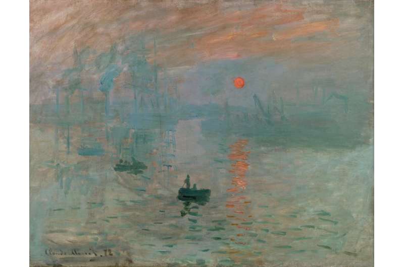
One data impression my colleagues and I have developed echoes the work of impressionist painters who used shifting light and color to depict an impression of a scene, like Claude Monet’s in his 1872 painting Impression, Sunrise.
The island of Flat Holm is a nature reserve that sits a few miles off the coast of Cardiff, Wales in the Bristol Channel. Flat Holm contains rare plants, such as rock sea-lavender and wild leek, and a colony of lesser black-backed gulls. Its protection depends on it remaining a place of interest in the public consciousness. Lots of data has been collected on the biodiversity of Flat Holm over the years, and a local weather station keeps tabs on the sunshine, wind and rainfall.
A temporary exhibition running at the Techniquest science museum in Cardiff depicts some of these data streams using colored LED lighting, moving parts and reflective surfaces. An online app was developed to support the exhibit and is now used by the island warden to count and report the number of seagulls, butterflies, shelducks and other species. An impression of this data is then revealed to the audience at the museum through an interactive map.
A touch of the seagull button on the display releases a pattern of color and movement. If lots of seagulls have been counted on the island, the shifting colored LED lights are vibrant and fast. If few seagulls were reported, the flickering LED lights are slow and calm.
The exhibit also captures a real-time impression of what the weather on the island is like. Data pulled from the weather station turns prism-shaped panels on a mechanical display to give an impression of how sunny, cloudy or rainy the weather is.
The exhibit allows visitors to immerse themselves in a visual display of life on the island. Like impressionist paintings before, it uses aesthetic elements and principles to make the data feel more real. If scientists are to successfully engage people with complex data, they need to generate experiences that allow them to connect and relate to it.
This article is republished from The Conversation under a Creative Commons license. Read the original article.![]()
Citation:
How the scientific equivalent of impressionist paintings can make you feel data (2022, May 26)
retrieved 26 May 2022
from https://techxplore.com/news/2022-05-scientific-equivalent-impressionist.html
This document is subject to copyright. Apart from any fair dealing for the purpose of private study or research, no
part may be reproduced without the written permission. The content is provided for information purposes only.
For all the latest Technology News Click Here
For the latest news and updates, follow us on Google News.

