I love the new Safari address bar in iOS 15 and you will too
When I finally got around to downloading iOS 15 to my iPhone last week, I was filled with trepidation. It wasn’t fear of bugs or broken apps or battery health. It was because of the new Safari.
As I waited for the bar below the Apple logo to fill, I found myself thinking of the numerous articles I’ve read (and edited) on how terrible the Safari experience on iOS 15 is. A dramatic overhaul of both the iPhone app and the mobile browsing experience, the new Safari was so polarizing during beta testing that Apple regularly tweaked the design and functionality, and ended up adding an option to undo the biggest change.
But while the change is certainly jarring and a bit of a shock, I kind of like it. After a few days, I’ve learned my way around and gotten used to the new refresh gesture. I like the website tinting and the customizable start page. The new tab overview screen lets me quickly see what’s open. Swiping on the address bar quickly switches tabs. And when you switch to landscape view, you get a desktop-inspired tab layout that’s smart and unique.
The most intriguing new feature is Tab Groups. While I haven’t yet incorporated it into my workflow, the concept is fantastic. I often have numerous tabs open, particularly on my Mac, and having a way to keep them categorized, organized, and synced across all of my devices will be a huge help when working. I often use iCloud Tabs on my iPhone to open websites from my Mac and vice versa, and Groups will make it that much easier to keep everything organized.
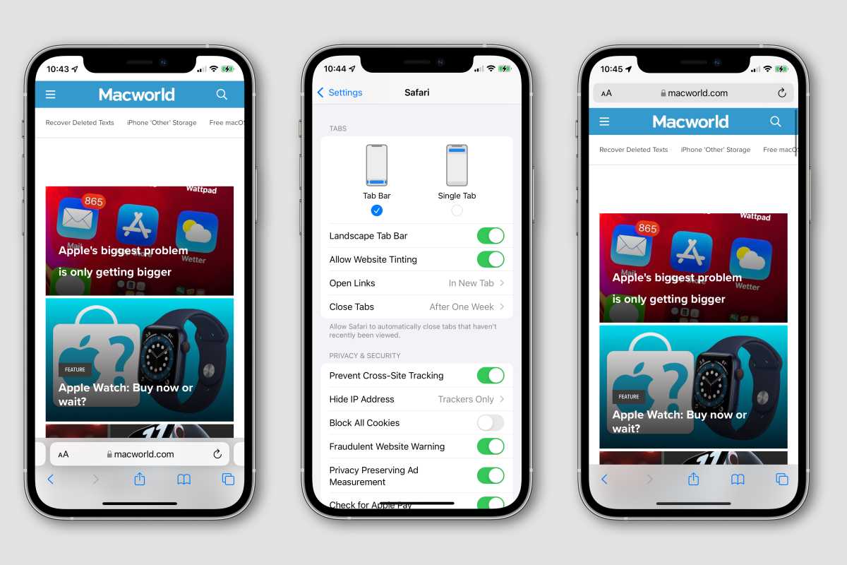
However, my favorite feature is the one everyone else seems to hate: the address bar. If you’ve installed iOS 15, you’ll know that Apple has changed it in a major way. The address bar has been moved to the bottom of the screen along with all of the buttons and controls, leaving the top completely empty. It’s very different, but the more I use it, the more I wonder why smartphone browsers weren’t built like this to begin with.
Design within reach
Safari in iOS 15 has gone through a series of changes since it was unveiled at WWDC. What started as an ultra-minimal strip at the bottom of the screen. Important buttons like back, forward, reload, share, and reader were tucked away behind a three-dot menu, and everything took a tap or two longer to access.

You can move the address bar to the top of the screen in Safari, but don’t rush to do that.
IDG
In beta 4, Apple started making small changes, first bringing the reload button and share buttons back, then returning the full toolbar below the address bar and adding an option to move the address bar back to the top of the screen, something of a rare mea culpa by Apple.
While a web search for “Safari iOS 15 address bar” will reveal a ton of articles explaining how to move the address bar back to the top of the screen (including one for Macworld), I’m not moving mine. The bottom of the screen is the perfect place for the address bar, particularly when you’re using a giant phone like the iPhone 13 Pro Max. It’s not quite one-handed browsing, but it’s much more comfortable than reaching all the way to the top of the screen.
When you scroll, the address and toolbar melt away into a sliver at the bottom of the screen, giving you as much space as possible for browsing. Yes, it takes some getting used to—both visually and gesturally—but once you get used to it, you’ll wonder why you were stretching all the way to the top of the screen for so many years.
Safari in iOS 15 is so good, I hope it’s the start of a new design language for iOS. Shifting tools to the bottom of the screen, embracing as much screen as possible by shrinking toolbars, and deftly crafting interfaces that work in portrait and landscape modes.
Safari had a bumpy start in iOS 15, but ultimately I think Apple got it right. And I don’t know how I ever surfed any other way.
Michael Simon has been covering Apple since the iPod was the iWalk. His obsession with technology goes back to his first PC—the IBM Thinkpad with the lift-up keyboard for swapping out the drive. He’s still waiting for that to come back in style tbh.
For all the latest Technology News Click Here
For the latest news and updates, follow us on Google News.

