Keychron Q11 QMK review: An ergonomic mechanical keyboard with great value
 At a glance
Expert’s Rating
Pros
- Sturdy build
- Hot-swappable switches
- Easy keyboard programming in VIA
- Priced very competitively
Cons
- Slightly awkward keyboard layout
- No tenting kit available (not even as an optional accessory)
Our Verdict
Cheaper ergonomic keyboards exist, but not by much—and not with the Keychron Q11’s level of customization and more premium materials. It feels good to type on, and its 75-percent size deftly balances the needs of keeb minimalists with folks who need more dedicated keys. The only notable ergo feature missing is a tenting accessory.
Best Prices Today: Q11 QMK Ergonomic Mechanical Keyboard
Until recently, mechanical keyboards were out of my reach. Ergonomic mechanical keyboards aren’t yet common, and those that exist are expensive. At least, expensive by normal people standards—keeb fanatics might not blink twice at spending several hundred on a keyboard (much less yet another for their collection), but I do.
So when Keychron prepared to launch its Q11 QMK split keyboard, PCWorld’s resident mechanical keyboard expert Michael Crider asked if I, a person who’s been chained to a Goldtouch keyboard since the dark ages, wanted to give it a spin.
Heck yes I did.
Further reading: See our roundup of the best gaming keyboards.
Keychron Q11 QMK value
One of the reasons for my excitement: The Q11 isn’t just an ergonomic mechanical keyboard. With all of its features, the Keychron Q11 is a surprisingly affordable ergonomic mechanical keyboard compatible with both Windows and Mac computers.
Dygma
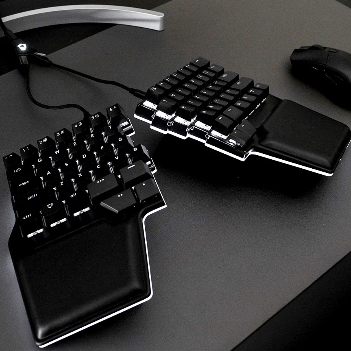
Rivals that cost about the same have soldered switches (e.g., Kinesis Gaming Freestyle Edge, Cloud Nine ErgoTKL, Cloud Nine ErgoFS). On the other end of the scale, more customizable keyboards like the Zsa ErgodoxEZ easily hit $300, with boards like the Dygma Raise pushing into the $400 range. Many in the higher range are compact boards, too, leaving few options if you like dedicated arrow keys (much less function keys).
Meanwhile, the Q11 offers plenty of customization—hot-swappable switches, two rotary dials, a CNC machined aluminum body, easy QMK/VIA programming—yet costs $205 fully built. It lacks a tenting kit accessory (a feature built into the Kinesis and Cloud Nine boards), but Keychron says it’s considering whether to make one. (Yes, please!) These aspects don’t affect ergonomics, but the Q11 feels nice for its price.
Keychron Q11 QMK design
The Q11’s split design is what makes it ergonomic. Better ergo keyboards commonly share that one feature, though with different takes.
More affordable boards are usually one piece, with each half of the keyboard set apart at a fixed, unchangeable width. They dominate in stores like Best Buy. The more expensive models (i.e., the ones you’ll find on specialized websites) let you adjust the position of the two keyboard halves—change the distance between them, adjust their angle, or both. Keyboard spacing can hugely affect comfort during the day, especially if you’re pounding on it for hours at a time.
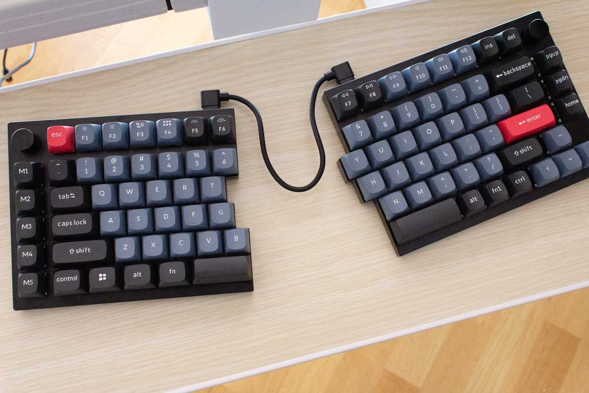
The Keychron Q11 skips past the junior leagues with a fully split keyboard design, joined together by a standard USB-C cable. You can adjust the distance between the two halves of the keyboard, as well as their horizontal angle.
Alaina Yee / Foundry
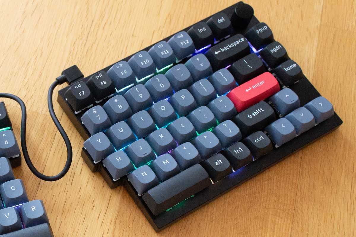
This 75-percent keyboard has a polling rate of 1,000Hz, and includes function keys, arrow keys, and a strip of five programmable macro keys on the left. You also get dedicated page up, page down, and home keys on the right side of the board—but no end key. Metal knobs (two total) sit in the upper left and right corners, which control your PC’s volume by default. Clicking them to mute your sound produces very solid (and satisfying) tactile feedback.
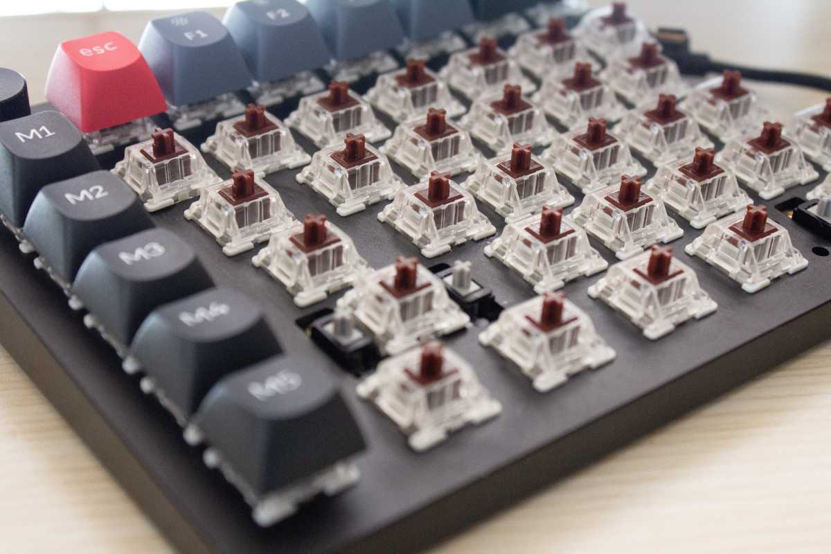
Included with the fully built board are double-shot OSA PBT keycaps, which blend the height of an OEM keycap with the shape of an SA keycap. Underneath are your choice of Gateron G Pro switches in either red or brown. (For our review unit, I chose brown.) The $185 bare-bone model skips the switches and keycaps, leaving it entirely to you to populate it yourself.
For those who are new to mechanical keyboard customization (like me), the fully built option is the easier way to go. The Q11 has a slightly unique layout for its spacebar row, with a Ctrl, Windows, Alt, and Function key crammed on the left side of the board. On the right side, there are Alt, FN1, and Ctrl keys. Keychron helpfully provides the measurements you’ll need if you bring your own keycaps, but it’s that much more to figure out and decide on when getting started. Also, it seems harder to find compatible keycap sets on AliExpress. (Hello, am newb, please give me your l33t cheap shopping tips.)
The Keychron Q11 does an excellent job bridging the gap between the most affordable ergonomic mechanical keyboards and more expensive ones with higher customization.
Alaina Yee / Foundry
As for the RGB lighting—the south-facing LEDs are clear and easy to see as the typist, and Keychron gives you 20 pre-programmed patterns to choose from. (My personal favorite: Pixel Rain, which gently blinks different keys on and off in a random pattern, with softer colors than the typical unicorn vomit look.)
How does it feel to use the Keychron Q11?
PCWorld
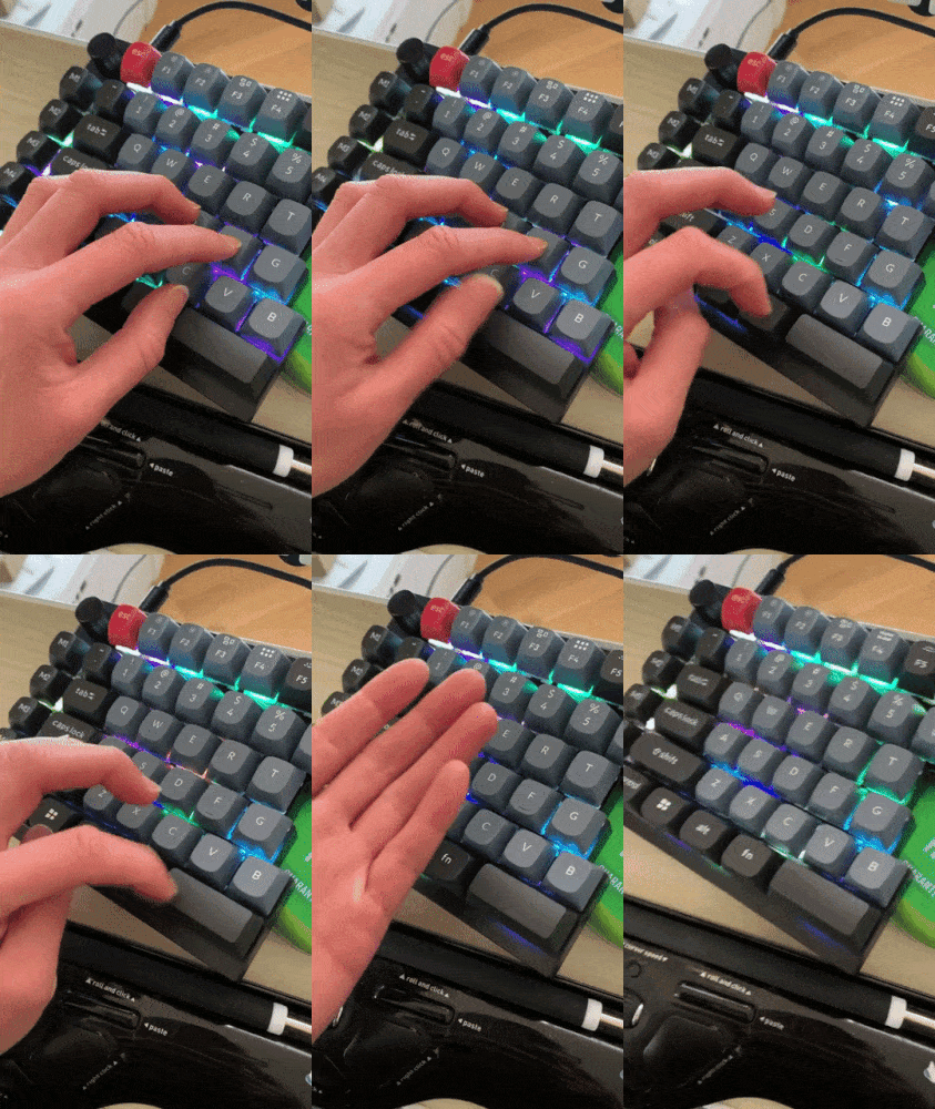
After an initial acclimation period (in which I may or may not have messaged Michael with all the drama of someone who hates change), the Q11 grew on me. It has a solid, weighted feel and feels sturdy when banging away on it. I do use much more force than before when typing (closer to the times I’ve used a manual typewriter), but the experience isn’t uncomfortable and I can always swap the switches. Once the vast amount of choices out there stop being so overwhelming, at least.
I only have two personal complaints—first, the layout of the left spacebar row. I would have preferred a longer spacebar. With the size of my hands and how I type, I spent about two weeks with my left thumb unpleasantly hitting the gap between the Function key and the spacebar until my muscle memory adapted.
The second is the lack of an End key. I use it all the time as a writer/editor, and on my Goldtouch keyboard, it sits on the right side of the keyboard. Why the empty spot under the home key, Keychron? An End key would have fit perfectly there. And yet, a small void instead.
Alaina Yee / Foundry
Fortunately, those programmable macro keys exist, though I would have much preferred a dedicated key (with matching labeled keycap). Programming the board is super easy through the VIA web app, and the Q11 supports two different layers of keystrokes per supported operating system. On the main layer for Windows, it took about five minutes to figure out and set the macro keys to include my beloved End key, plus shortcuts for various apps and program commands. Another five minutes of trial and error and I had a ten-key pad in the second layer (activated using the FN1 button)—and it only took that long because I re-created my Goldtouch keyboard’s version of this (and its layout) from memory.
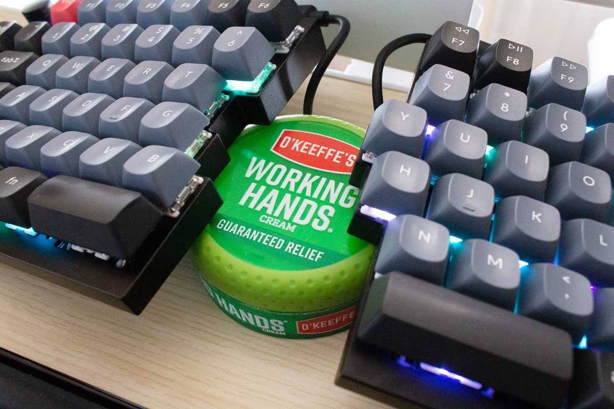
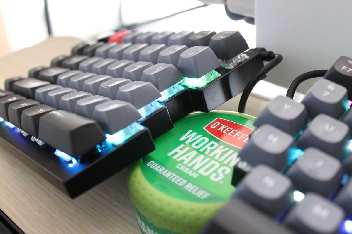
One unexpected side benefit of Keychron’s fully split keyboard design: The board is more portable, if you needed to pack it up. (My Goldtouch keyboard has one big joint that binds the two halves together.) No carrying case is included though, and as mentioned above, a tenting kit doesn’t exist. I require vertical tilt for proper ergonomics, so I’ve been making do with a plastic tub of hand cream for a modest angle. It doesn’t feel as comfortable as my Goldtouch keyboard’s more dramatic tilt, though.
Should you buy the Keychron Q11?
The Keychron Q11 does an excellent job bridging the gap between the most affordable ergonomic mechanical keyboards and more expensive ones with higher customization. Even its 75 percent size deftly sits in the middle between those two camps. Less costly boards trend toward full-size or tenkeyless, while the pricey ones often cater to keeb minimalists. The only notable ergo feature missing is a tenting accessory, but hopefully Keychron will produce one in the near future.
For all the latest Technology News Click Here
For the latest news and updates, follow us on Google News.


