Motorola Edge+ (2023) Review: Android Flagship Phone Greatness With One Major Flaw – SlashGear

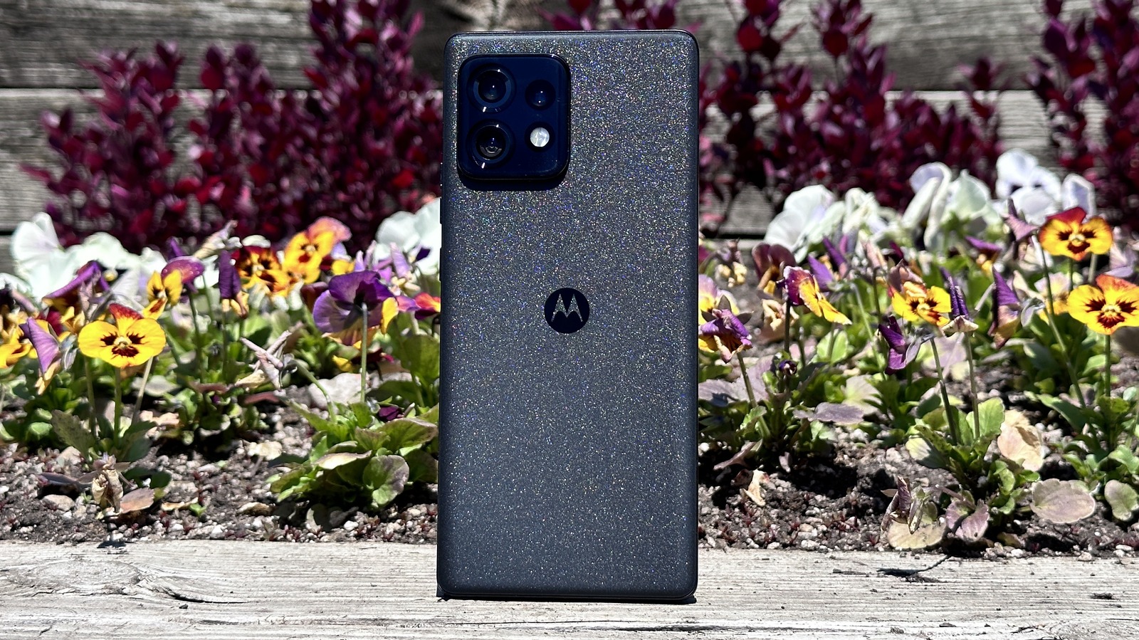
Right off the bat, the Moto Edge+ looks really good. It’s a typical glass sandwich with an aluminum frame. Both sides of the phone are covered in Gorilla Glass Victus, but the back of the phone’s colorway is called Interstellar Black, for good reason. The back of the phone is glittery and seemingly covered in sparkles, so it looks like a starscape in the right light. It’s really quite a sight.
Around the outside edge, you have three separate buttons for volume and power, a SIM tray on the bottom, and top and bottom stereo Dolby Atmos speakers. What’s nice about the speakers is that Motorola isn’t copping out by using the earpiece as one of the speakers. There’s a whole separate grill there to project sound outward. Speaking of which the speakers sound good — for phone speakers. Not to put too fine a point on it, but while no phone speakers sound great, these sound pretty good.
The display on the front is a 6.7-inch 1080p display that looks really good and has a 165Hz refresh rate. You can lock the refresh rate to 60 Hz, 120 Hz, or 165 Hz, or set it to a variable refresh rate. Unfortunately, that variable refresh rate does not include 165 Hz, so you can go ultrasmooth all the time, or not at all, which felt like an odd choice.
For all the latest Games News Click Here
For the latest news and updates, follow us on Google News.
