PC diehards are wrong: Why I love Windows 11’s controversial new look
Let me start with a disclaimer: I am primarily a Mac user writing about Windows 11. For more than a decade, I’ve used a MacBook Pro as my primary work computer. I’m no stranger, however, to Microsoft’s operating system. Prior to my embrace of macOS, I used a Windows PC at my job and at home, starting way back with Windows 95. (I recall my Windows XP years fondly.) Windows 10 was never my day-to-day operating system, but I covered its release and have banged on Windows 10 laptops and desktop for years for product reviews.
As a Mac convert with one foot still in the Windows world, I welcome the look and feel and centered Taskbar and revamped Start menu of Windows 11. Windows 10 users have several reasons for sticking with their current OS, but I’d argue the design departures Microsoft made with Windows 11 shouldn’t be a sticking point to upgrading. And Mac folks who use a Windows PC at work or for some other facet of their life will feel immediately comfortable with the bright and cheerful Windows 11.
Here’s how to get Windows for cheap (or even for free)
Centered Taskbar is a win-win

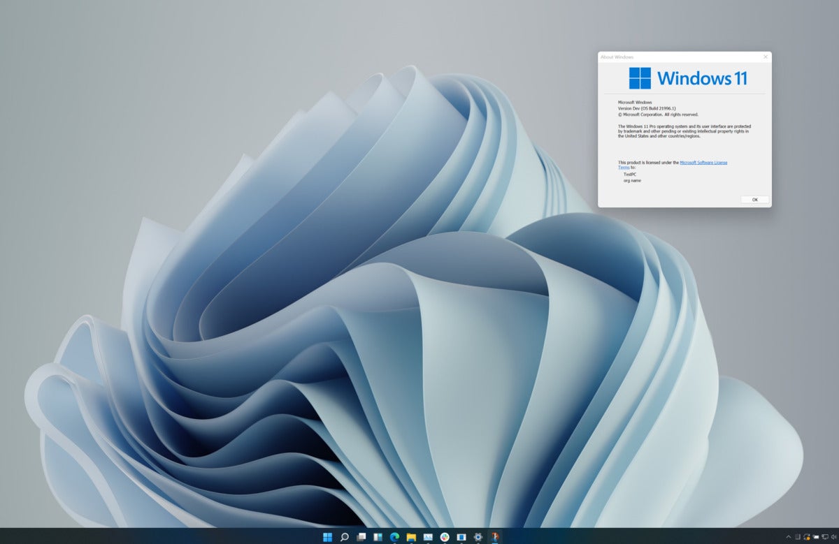
The Taskbar is centered in Windows 11, rather than in its traditional left-aligned position.
PCWorld
The most obvious change on the surface for Windows 11 and the first one you’ll notice — after digesting the rounded corners and pastel color palette — is the position of the Start button. It’s no longer stuck in the lower-left corner where it’s been for version after version of Windows for decades, all the way back to Windows 95.
The buttons in the Taskbar are now centered on the bottom edge of your display with the Start button as the leftmost button. This positioning works for me because that’s where the Dock in macOS sits. And it requires fewer swipes of my mouse or on my touchpad to access than moving my cursor to the corner of my screen. Faster access to a more familiar location? Sign me up.
(Longtime Windows users with muscle memory that automatically takes them to the lower-left corner can easily return the Start menu to its ancestral home in Settings.)
After the centered Taskbar, the next biggest departure from the past versions of Windows is the overhauled Start menu in Windows 11. If Microsoft borrowed the centered Taskbar from macOS, it took inspiration from Chrome OS for the new Start menu.

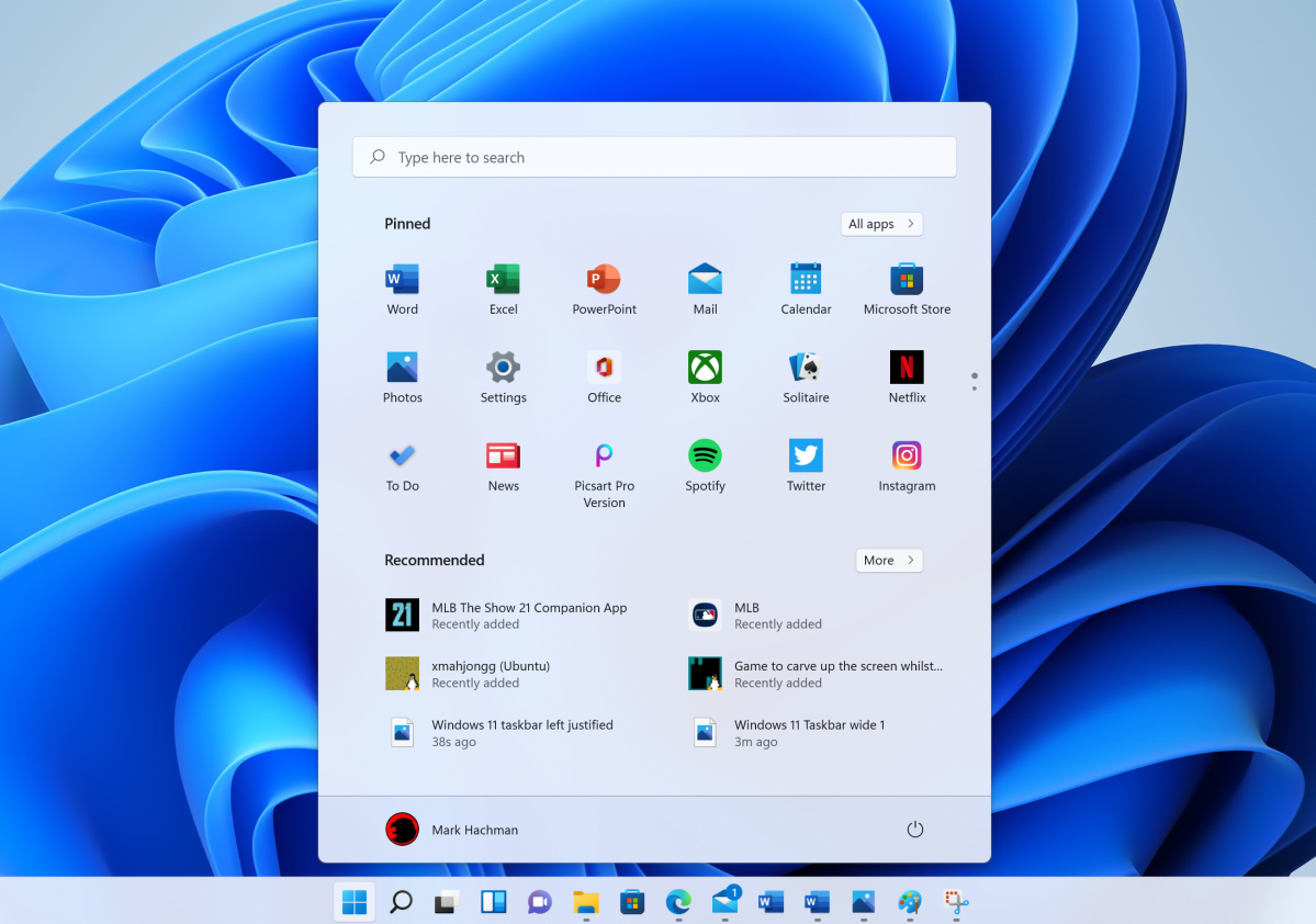
Windows 11’s new-look Start Menu.
Mark Hachman / IDG
Gone are the live tiles from Windows 10 that I never used or liked. They are oversized to be poked at with a finger on a touchscreen, but most Windows users are rocking a display sans touch support. When I’m moving the cursor on my screen with a touchpad or mouse, I have fine control that doesn’t necessitate a grid of huge tiles. And this assumes these clunky tiles that dominate the Start menu are useful to begin with. The Productivity section might be handy for launching Word or Excel, but I’ve already got those frequent flyers pinned to my Taskbar. I ignore the shovelware tiles in the Explore and vendor sections — never, not once, have I clicked on a tile there.
Taking the place of the departed live tiles is a grid of smaller icons for your pinned apps front and center that has a similar feel to the App Launcher in Chrome OS. This layout lets me see more of my apps on the screen at once than I could with live tiles, and the simple grid makes it easier to spot the app I’m looking for than the cluttered collection of live tiles.
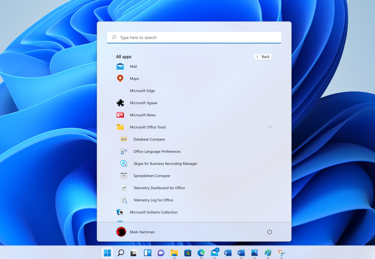
Looking for the alphabetical list of your apps that took up the left half of the Windows 10 Start menu? It’s only a click away in Windows 11. I employ this list only as a secondary source when navigating Windows so I don’t mind it one layer deeper in Windows 11. When I don’t see the app I need in the grid of my pinned apps, I can simply click the All Apps button that sits just above it to scroll through the All apps list. Or I search for it.

Windows 11’s All Apps overflow menu in Start.
Mark Hachman / IDG
You might think that using the search function in Windows 11 requires an extra click because the search box is no longer in the Taskbar next to the Start button. Not so. Despite its absence from the Taskbar, searching in Windows 11 remains a one-click operation. You need to click inside the search box in Windows 10 before typing in your search term. In Windows 11, one click on the magnifying-glass icon in the Taskbar lets you immediately start entering in your keywords because Windows 11 smartly puts your cursor in the search box that opens up without requiring an extra click to start typing. Windows 11 serves up the same, quick, one-click access to search but inside a cleaner Taskbar.
Two steps in the right direction
Like most Mac users, I can usually be found moaning and complaining when the subject of Windows comes up. And there’s still dozens of things about Microsoft’s OS that make me crazy and will keep me replacing my MacBook with another MacBook. I must admit, however, that Microsoft got at least two things right with Windows 11.
To my eyes, the new Taskbar and Start menu are improvements over their prior forms that have rolled over from one Windows version to the next for years and years. Sure, I’d like to be able to adjust the size of the Taskbar in Windows 11 as you can with macOS to match the size and resolution of my display, and I’d like better control over how my pinned apps are arranged in the Start menu, but both tools are redesigned in the right direction. They look friendlier and more modern and get me more quickly and easily to the places I want to go in Windows 11.
For all the latest Technology News Click Here
For the latest news and updates, follow us on Google News.
