Users didn’t like the new Safari tab design in macOS Monterey, so Apple tweaked it
One of the features that Apple spotlights in the upcoming macOS Monterey upgrade is Safari’s new tab bar—it affects the overall user interface and how you use Safari. Aapparently, those who have been using the Monterey beta have let Apple know its not a welcome change. It looks like Apple has taken the criticism to heart, because in the latest Monterey beta, Safari’s UI is a lot more like the one we’re all familiar with.
The big change has to do with the URL/search box. Apple had made it so that the box was dedicated to a single tab. When you clicked on a tab, it became the active page, and the tab itself would show the URL box. Apple did this to maximize the amount of space for websites, even though it amounted to small number of pixels and didn’t really dramatically change a site’s appearance.

This is what Apple proposed as the new tab UI in Safari 15. In macOS Monterey beta 3, Apple provides an option to use a UI that’s more like the current Safari.
IDG
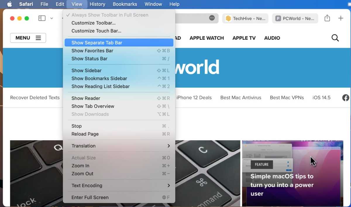
In macOS Monterey beta 3, Apple has added the option to set Safari’s UI so it is more like what people are used to, with a stationary URL/search box at the top, the tabs arranged below it, and a dedicated reload button instead of the reload function hiding inside the More (…) button. This new option is enabled by default, and you can switch between it and the single-row design via View > Show Separate Tab Bar.

Safari in macOS Monterey will have the option to show the Tab Bar as a seaprate component of the UI.
IDG
This new Tab Bar option is currently only implemented in the version of Safari 15 that is included with the Monterey beta 3. Apple has a Safari Technology Preview of version 15 available for macOS Big Sur, but as of this writing, it has not be updated with the new Tab Bar option.
Roman has covered technology since the early 1990s. His career started at MacUser, and he’s worked for MacAddict, Mac|Life, and TechTV.
For all the latest Technology News Click Here
For the latest news and updates, follow us on Google News.
