Windows 10 vs Windows 11 design changes: take a look at the redesigned Start menu, desktop, File Manager, and more key UI elements | 91mobiles.com
Windows 11 was leaked and subsequently unveiled earlier this month. Microsoft showcased some of its key features, including a significant UI overhaul, new QoL features, and more. There are heaps of under-the-hood changed too, which Microsoft is yet to disclose. The next-gen OS is expected to roll out officially sometime towards the end of the year, but you can install an early developer build now by signing up for the Windows Insider Program. Do note that the Windows 11 version in question is, as the name suggests, an early build, so we wouldn’t recommend that you install it on your daily driver. Many current apps/ games might not work as intended, and you may have to perform a clean Windows 10 install if the rollback isn’t successful. Let’s take a look at some new Windows 11 features and how they look alongside Windows 10.
Windows 11 vs Windows 10: UI changes
Desktop
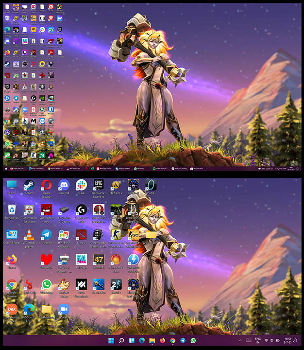
Upon booting Windows 11, you’ll immediately notice that the desktop layout has changed a little. The most significant change is the definitely-not-inspired-by-macOS relocation of the iconic start menu to the centre of the screen. You’ll also find your recently used apps lined up next to the Windows icon. Many icons for essentials, such as My Computer, Recycle Bin, and Control Panel get a UI, have also been redesigned. Similarly, the Action Centre gets a fresh coat of paint, too, but we’ll talk about that in just a bit. Windows 11 also syncs the desktop wallpaper from other devices associated with the same Microsoft account, which is a nice touch.
Start menu
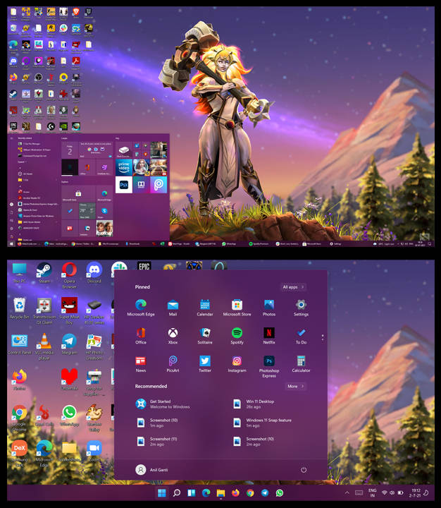
Moving on to the Start Menu, we get a significantly cleaner, clutter-free look. The ugly tiles have been replaced with sleeker-looking icons. You also get direct access to recently accessed files and documents, saving you the trouble of finding them on your device or setting up a desktop shortcut. Tapping on the All Apps button will take you to an alphabetical list of apps.
File Manager
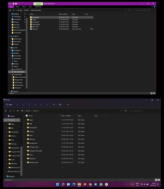
Windows 11 also revamps the File Manager in its entirety. The ‘File’, ‘Home’, ‘Share’ and ‘View’ buttons from Windows 10 are gone and are replaced by commonly used actions such as cut, copy, paste and delete. You can also customize how the files will be arranged and the icon size directly from within the file manager app. Other than that, the changes are mostly cosmetic.
New right-click options
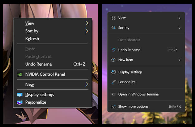
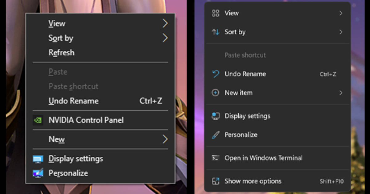
One of the most subtle Windows 11 changes involves how the right-click menu looks. The prompt that shows up is slightly more enlarged and bereft of some key options that we’ve taken for granted, such as ‘Sort by’ and ‘Refresh’. Clicking on ‘View More’ will take you to a more familiar version of the right-click interface.
Action Centre
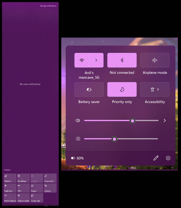
As mentioned earlier, Windows 11 completely reimagines the action centre from the ground up. The square-shaped tiles for Bluetooth, Wi-Fi, etc., now have a more minimal feel to them. Furthermore, the Action Centre does not take up the entire right half of the screen, which is nice. Some of the lesser-used options, such as VPN, Night Light, Connect and Project, have been removed entirely, but adding them back is fairly easy. Lastly, you can also control your screen’s brightness and speaker volume from the Windows 11 Action Centre.
Settings app
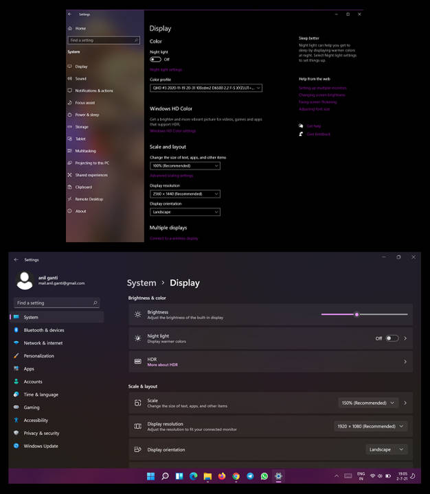
Much like the Start Menu, the Settings app on Windows 11 also gets a complete design overhaul. Everything is listed in a neat column at the left of the screen. Clicking on any button will give you additional options pertinent to that topic. For example, I clicked on ‘Display’ button under ‘System’ and was presented with display-specific data such as the screen brightness, resolution, display scaling, etc. In its current state, the Windows 11 Settings app is fairly buggy, but that is expected from a developer build.
Microsoft Store
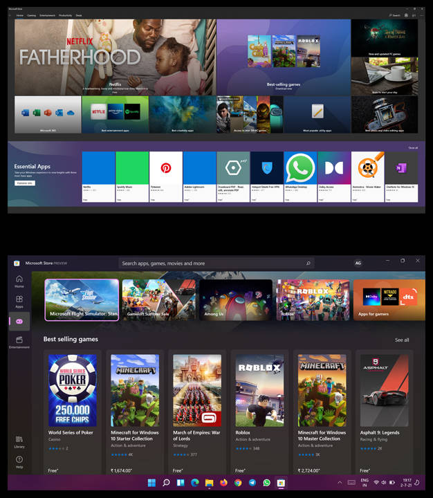
Lastly, the official Microsoft Store get a fresh coat of paint, too. Much like other Windows 11 UI changes, the new Microsoft Store has pushed everything from the top to the left. The ‘Productivity and ‘Deals’ buttons from Windows 10 have been removed altogether. The ‘Gaming’ tab will let you access the entirety of the Xbox Game Pass library, provided that you are subscribed to it.
New Windows 11 features
Virtual Desktops
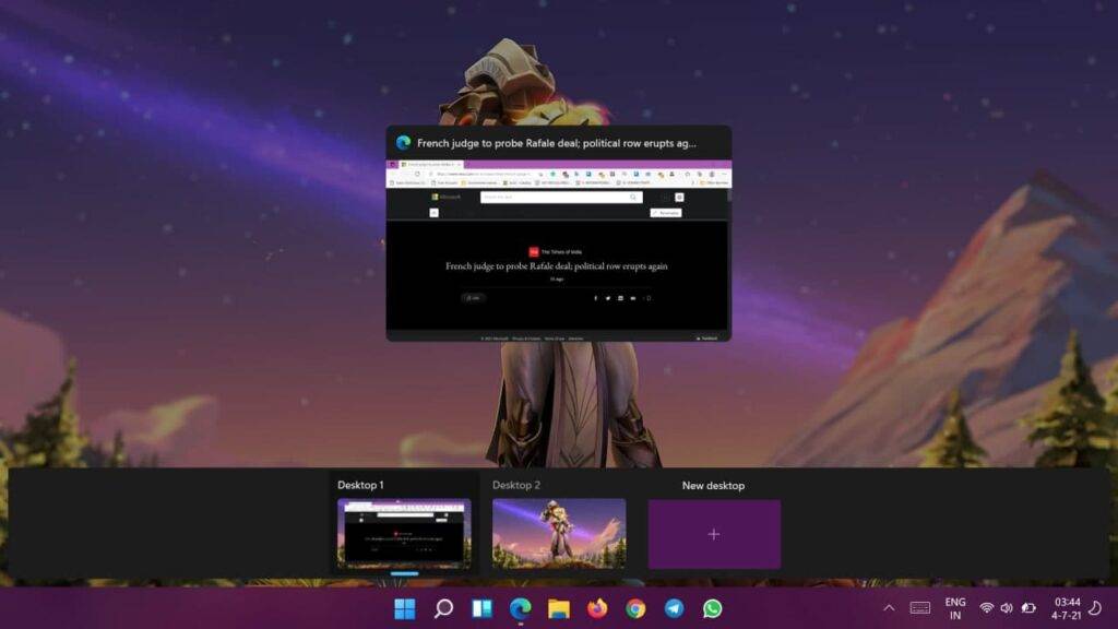
Virtual Desktops is yet another feature Microsoft ‘borrowed’ from the Apple side of the aisle. Windows 11 lets you create custom desktops from scratch. Switching between them is fairly easy, too. All you need to do is press the ‘Win’ and ‘Tab’ keys together, after which you’ll be presented with an option to create a new desktop. Switching between them involves the same button combination. On a laptop, you can also swipe four fingers left/right to switch between desktops. I wonder where Microsoft got this novel idea from…
Widgets
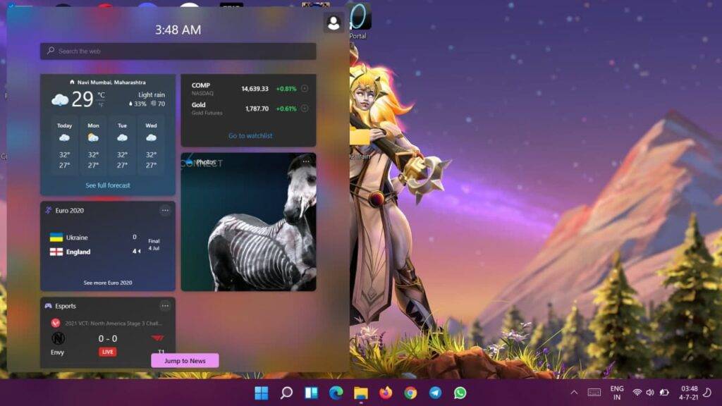
For some reason, Microsoft decided that adding Widgets to a desktop-grade operating system was a ‘new’ idea. The feature has existed on Android smartphones forever and iOS devices since last year. Widgets essentially let you peek at the weather, your photos, some sports stats and other things of your choosing. There is even a dedicated news section that tries to imitate Google Discover. Nonetheless, it is a good place to glance over headlines when you’re in a rush. Interacting with any widget will open a new tab in the operating system’s default browser.
Snapping Windows
This is arguably one of the best upgrades that Windows 11 brings forth. It is now possible to arrange individual applications in four different orientations. Windows 10’s wasn’t particularly good at snapping windows together, which is somewhat ironic. Users with high-resolution and ultra-wide monitors will find it much easier to arrange their applications in a manner that allows for seamless multitasking. To get started, hover over the ‘Maximize’ button on any window. You’ll then be presented with four possible orientations that you can arrange your windows in, which include two windows side-by-side, one window taking up half of the screen and two others occupying the remaining halves, and four windows equally occupying the whole screen. Additionally, windows set in such an orientation will show up as groups on the taskbar.
For all the latest Technology News Click Here
For the latest news and updates, follow us on Google News.
